SA data on consumption
The study material makes the simple distinction between household and government spending. The data on these are interesting.
Household spending
For households, the major source is the Income and Expenditure Survey conducted by StatsSA. You can check out the summary here. It is is nationally representative data used to study income and inequality, to set poverty lines and update the consumption basket used to calculate the consumer price index. But unfortunately, it is such a big job that it is not published frequently. The latest is the 2022/23 survey published in 2025.
There is also more high-frequency and fun data out there, like the Uber Eats Cravings report. EWN says: chicken remains the most craved item on the menu. Pretty much… searches we saw for chicken, nationally, and really curated with pap – stood out as the country’s signature combo,” says Ntsoaki Nsibanyoni, General Manager for Uber Eats Sub-Saharan Africa.
And there is the bank reports of Black Friday spending on their cards. Capitec reported: Groceries emerged as one of the highest spend categories during the Black Friday weekend, with more than 112 transactions per second and 10 million total transactions to the value of R3 billion.
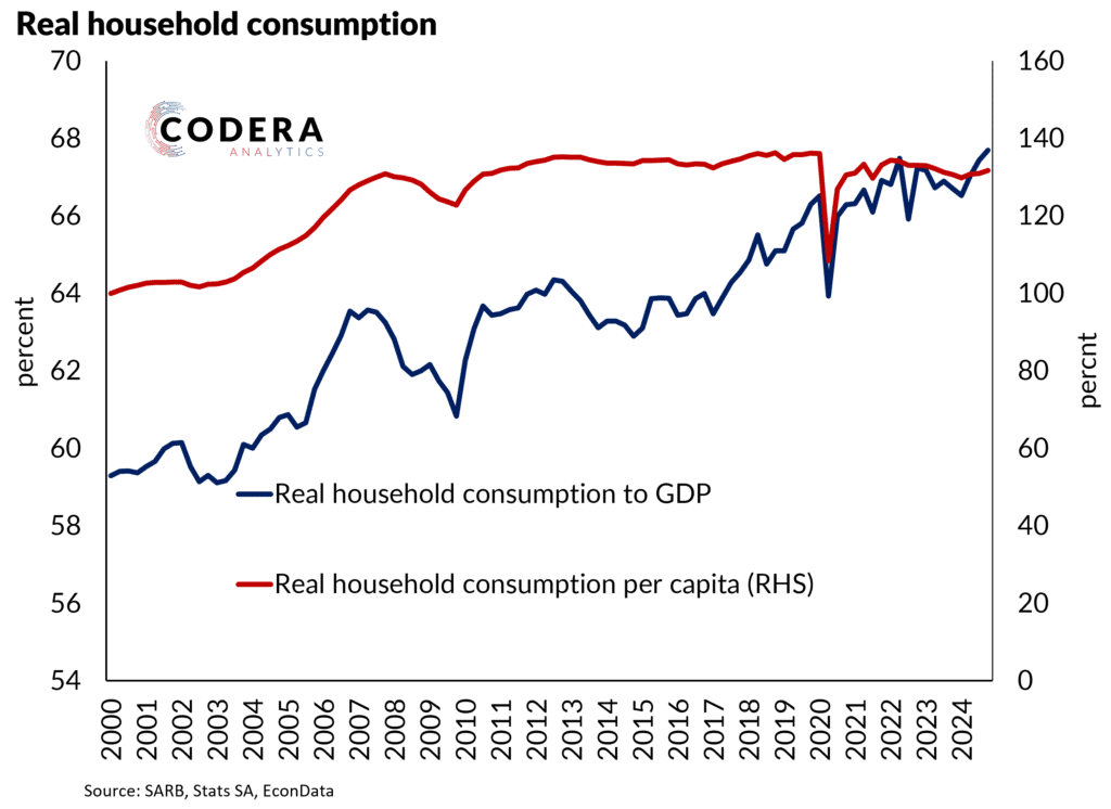
At the macro level, household consumption spending is a driver of economic growth, but the Codera graph shows that adjusted for inflation, per capita spending has been falling.
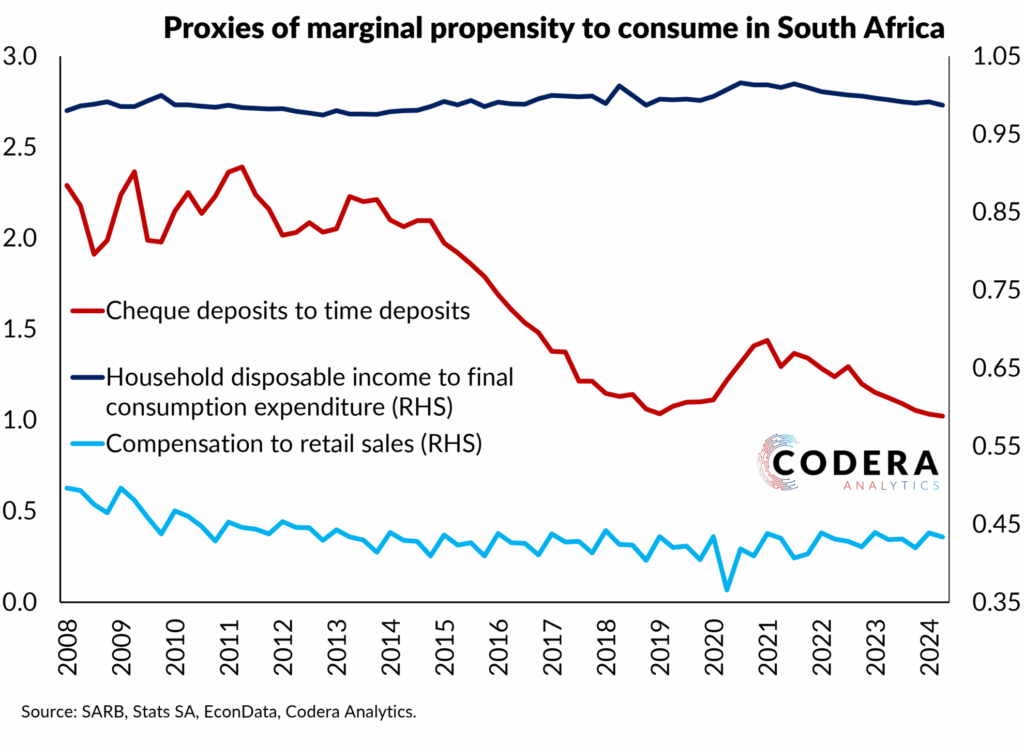
It is related to people’s ability to spend the extra rand. Economists talk about the marginal propensity to consume. While the ratio of household disposable income to consumption has been flat since 2008, the ratio of cheque deposits to time deposits and the ratio of compensation to retail sales have both declined. During this period, the household saving rate has been negative on average, so this decline would be consistent with higher consumer stress, weak consumer demand and borrowing capacity. Social grant income would be reflected in disposable income, which might be one reason why the blue line is flatter than the cyan line.
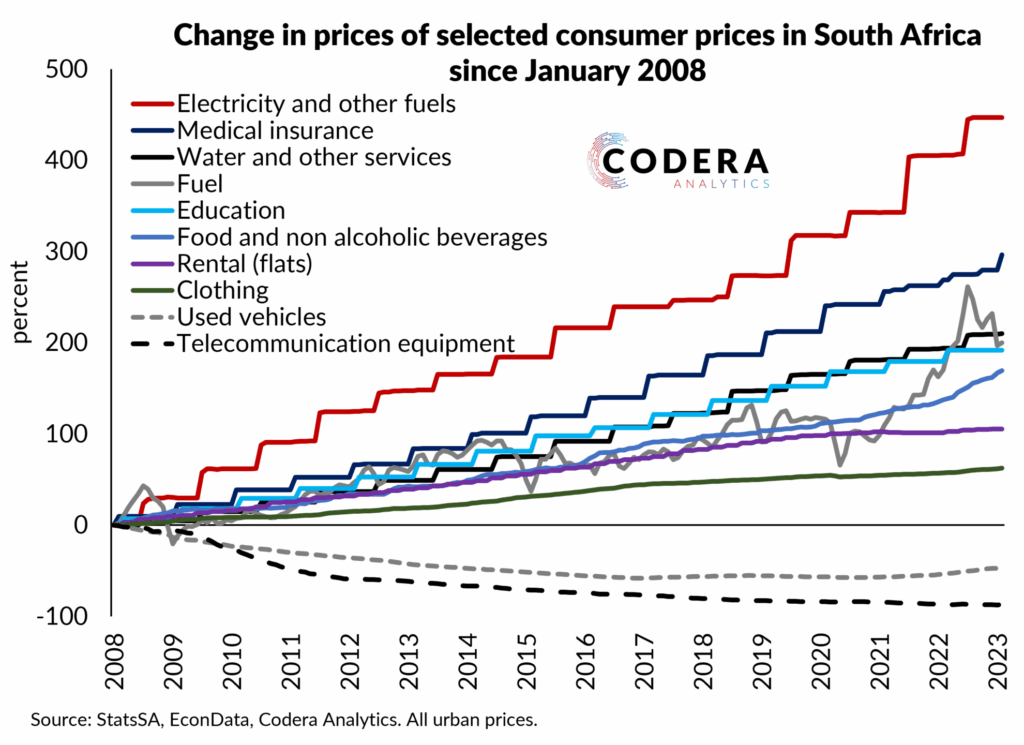
We will talk a lot more about inflation later. If income is not growing (much) and prices keep increasing, households cannot spend. The graph below shows cumulative changes in consumer prices.
Government spending
There is a lot more data available on government spending. This can be classified by functional classification (by departments) or by economic classification (current v. capital).
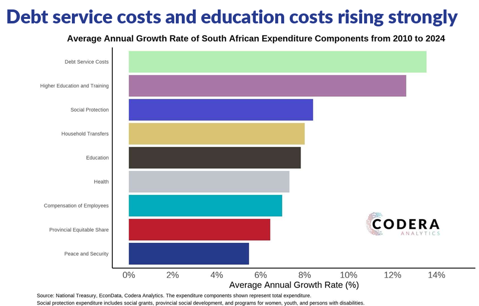
Codera’s fiscal analytics silde deck has excellent graphs outlining the fiscal sustainability issues facing government, but lets just share the spending for now.